Monday, December 12, 2011
Friday, December 2, 2011
Finished app icons!!!


Wednesday, November 30, 2011
10th Grade app icon!!!!

Monday, November 28, 2011
Ind. Photo Research/Study!!!!
I've studied the photography tips of shooting in black and white, and i discover the top 5 tips to taking pictures in black and white.
1- Shoot in raw, which means using an unprocessed image, hence the name RAW.
2-Shoot in color, so you can change it in black and white later on the computer.
3-Shoot in low ISO, and ISO is how sensitive your light sensor is.
4-Know when to shoot, most photographers shoot in low contrast situations.
5-All about composition!!
Monday, November 21, 2011


Wednesday, October 12, 2011

Friday, October 7, 2011

Negative Space!!!!!
So, pretty much negative space is the empty space around the subject or focus of the photograph. Here are some examples:


Monday, October 3, 2011
Business Cards!!
There are many different elements for graphic design, first you have to create effective layouts, that will attract an audience, then you have too look at the elements of design, which include lines, shape, texture,space, size, value,and color. Next you have to pay attention to the principles of design, which include creating balance, rhythm, emphasis and unity.Lastly you need to avoid, trapped white spaces, underlining, widows and orphans, etc.
These are some cool business cards I found.


These are some cool business cards I found.


Tuesday, September 27, 2011
Photoshop!!!! (finally)

I FINALLY finished my photoshop picture. Its of a flyer, and I used all the devices.
I'm finally done with this!!!!
Monday, September 26, 2011
Developing a theme!!!
For the end pages, i think it would look cool if they looked like the front of a smart phone, and at the top said "Autographs",then for the table of contents, it would be cool if they looked like message bubbles, and lastly for the student life, it would be cool if again it looked like the front of a smart phone, and there were pictures, on what appeared to be the screen, of the students.
Photography concepts!!

1- I feel this photo definitely has depth of field, because of the fish.
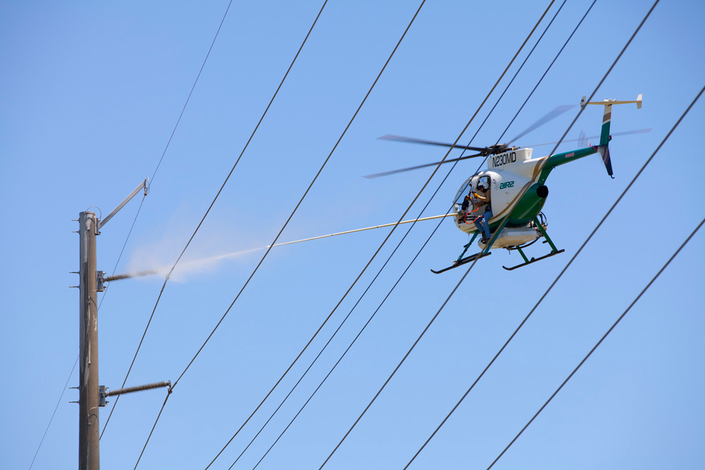
2-This photo has symmetry, with the power lines.
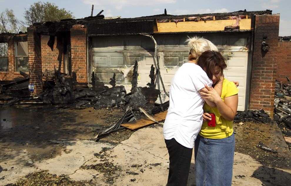
3-I think this photo has repetition with the ash, and torn house to the left of the photo.

4- This photo has rule of thirds, because your eyes are directed to the right of the photo.

5- This photo has bin taken at an unusual angle.Which is pretty obvious.

6-This photo has filled the frame, you completely focus on the cat.

7- This photo has balance with the mountain like structures and the fire.

8-This photo has a leading line, right in the center leading you to the small fire and smoke.

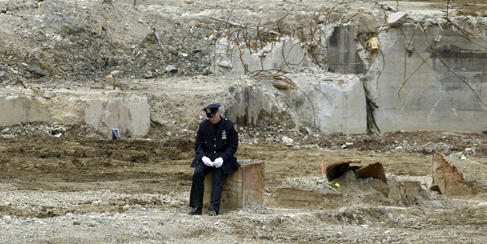
9-This photo has depth, with the fire behind the man.
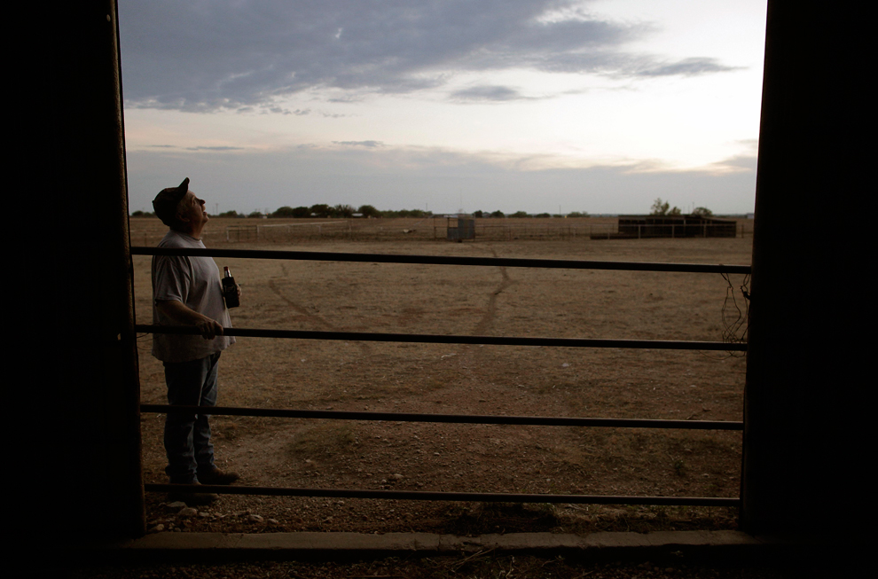
10-This photo has interesting framing, with the somewhat slanted walls closing in on the man, acting as a frame.
Sunday, September 18, 2011
Photo Evaluation!!

1- This one is using the rule of thirds, you are directed at the statue of liberty, but you are also drawn to all the smoke coming from the right of the picture.

2-This picture has symmetry with the cars on one side and the ambulances on the other, which creates a leading line.
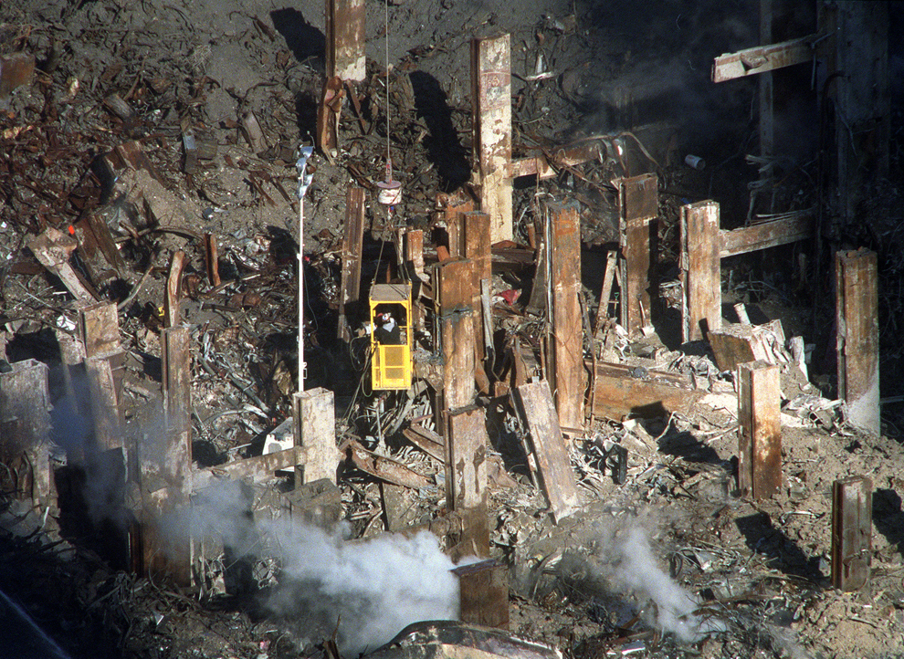
3- This photo has symmetry with all the metal planks, which somewhat leads to the man in the machine.
4-This photo uses object of field,because you see all the remains of the buildings behind the man, but you are still drawn to him.And you get a sense of sadness.

5- Lastly, you see that children are watching the twin towers fall, the photo is using the rule of thirds again, you are drawn more to the two girls in the front, on the right side of the picture.
These photos were the best, because you can tell with these, that they are more interresting, by how your eyes are drawn, and you can easily tell which techniques are being used.
Monday, September 12, 2011
Photo Scavenger Hunt!!

I feel this one fills the frame, because you can't see the ends of the petals, because its zoomed in on the center.And the petals act as leading lines. so you are directed to the center.

This one also has leading lines, you are lead to the building, and there is symmetry along side the pool, which also gives it a nice balance.

This photo, obviously, is taken at an unusual angle, but it also has rule of thirds, your eye is directed to the right of the photo.

This one has a low depth of field, your eyes are directed toward this girls feet, the framing also adds to the way we are being directed.

Lastly this photo shows alot of repetition, with the fence and the shadow each piece of wood casts.
Friday, September 2, 2011
Thursday, September 1, 2011
Photo Evaluation!
Picture 1, it seems the "rule of thirds" is being used, because my eyes are directed right in the middle of the picture, where there is a man holding a sign, and a rainbow colored flag. There also seems to be a lot of symmetry,a lot people are wearing black, which really stands out.
Picture 2, this one is also using the "rule of thirds" as well, my eyes are directed to the right side of the photo, towards the two women, it uses symmetry with the guards on their horses, and I infer that they are upset, because the guards are keeping them from getting across.
Picture 3, the "rule of thirds" is definitely being used, I can't look away from his eyes, which have symmetry, and this photo brings a lot of sadness, it seems he has been affected by the riot.
Picture 4, technically the "rule of thirds" is being used, but at the same time, there is really nothing else to be looking at. My eyes are directed to the students and then the one student at the front of the class, I get the impression that he has to teach the class.
Wednesday, August 31, 2011
Sketch!!


We went with the idea of a modern day journal. It was decided
the cover would be the same, but say "Tradition with a Twist", and it would be blue, on the inside there would be doodles connecting all the pictures, since people doodle in journal most of the time. And on the back, written in our school colors, and in different fonts, would be our school name.
Sunday, August 28, 2011
Yearbook Theme!

A very popular show, veiwed by most at school is "Glee", I took that into account
when coming up with a yearbook theme that would appeal to a majority of the
school.
Subscribe to:
Posts (Atom)